20100426
EVENTS
SEASICK MAMA

If you have a computer (of course you do) and a credit card (duh) get over to Seasick Mama and explore (and SHOP) their new concept shop PVAF. Preserving Visual Art in Fashion. Not only is there going to be a SLEW of wonderful artists showcased in this weekly collection...BUT...I am the cardinal artist for this project! I am so excited to be working with such creative people and can't wait to see the other shirts!
STYLEPHILE - BERNHARD WILLHELM
SPRING 2010

The Man Himself Photographed for 1o Magazine
I am loving this collection. It is fun, complex, energetic, whimsical, imaginative, thoughtful, challenging, innovative, brassy, organic, and everything else a person would want their life to be! The talent behind it is no exception to all of these adjectives. Having worked in some of my most favorite houses (Westwood, McQueen, Bikkembergs), it is no surprise his collections can stand alone. This Royal Academy of Antwerp grad may be a new Idol of mine. You can but it here.
20100417
AU NATURALE
FALLING FOR SPRING

Spring, God love you. I am so pleased that the winter is finally over and that flowers are out, and trees are growing leaves, and everything is turning from grey to green...I love the energy of weddings and graduation and new beginnings...summer travel is just around the corner, results from working off that holiday weight are visible...so what could be the problem?? POLLEN! Who knew that I have such terrible allergies that I have been stuck in a make-shift sick bay in the guest bedroom. Eek. Blech. Bah.
Not all is lost. In my medicated coma-esque state I have found a really cool trend for Fall. While lamenting the problems of spring and wishing for rain and colder weather to knock the pollen out of the air, I perused the looks of F/w 1o/11 and am LOVING the get tough patchwork, and touch of leather accents that are cropping up on the runways.
I have paired my favorite get tough in your wardrobe looks with some of my favorite get tough against pollen drugs...
Ahhhh! relief...
20100413
CURRENT OBSESSION
M.I.C.K.E.Y . PAS.SA.REL.LA TEES! (sung)
The latest collection of Tees from the fabboo band and brand Passarella Death Squad includes some of the most amazing graphics I've seen in a long time. The whole use of sex and Disney is done so well! The last time I had this feeling was when I wanted to be the Little Mermaid and then learned their was a giant phallus on the cover of her VHS...and was glad.

Can You Feel It (Daisy Duck & Pluto)
20100412
LOOKIE-LIEU
EAR BUDS

I only have one tattoo. I thought that was going to change, but it hasn't...yet. The problem is deciding what you want to get done and where and how and by whom and when etc, etc, etc...and that can become a daunting task when you consider that (outside of burning it off you) it is a permanent decision. BUT, that's really part of the fun too.
Finding myself wishy-washy on the inky details but decidedly pro and primed for self-mutilation, I found myself dreaming of the perfect piercing. I had never really thought about getting my ears did, but I found myself lobe focused during conversations. My eyes would wanter to the perimeters of a person's face an I would stop listening as I gazed at their ears wondering if I could pull off a pair of studs...And again the visions came of the pair i NEEDED to have...

So here they are. I had them made for me by the good people at YouMacbeth. Half carat black diamonds set in screw back white gold settings that had been dipped in black rhodium. They only took an afternoon that was casually and happily spent in downtown LA. Now that they actually exist, I had to pony up at Claire's...
I gotta say, I'm quite happy with the end result. It's not quite a tattoo, but it works. A little luxe edge never hurt anyone (thanks to a cautious teen at the mall), and I can always get my next tat when the inspiration comes...

20100406
ARTSY FARTSY
RUBA ROMBIC VON FURSTENBERG

I am OBSESSED...again. So many things these days are graphic and visual and hyper colored. While I am a big fan of clean, modern lines and bright shapes, too much of it creates visual noise that become drowning, boring and derivative. Into a visually exhausting sea of chaos and color I submit a clean and clear idea that may be a source of all of the deriving. In 1928 Consolidated Lamp and Glass Co. introduced it's "Ruba Rombic" collection of glassware. It so cool it could be the cover of a Neon Indian album. It blows my mind that this was done in the 20s! The natural, graphic appeal of this glass (my favorite is the fishbowl above with custom pedestal) has withstood the test of time and has made this one of the most covetable collectables around...if you can find it...
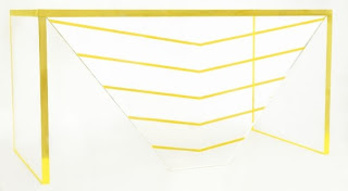
Can't seem to find any? There is a modern designer doing her thing in a similar way - this time out of clear acrylic with neon accents. Alexandra Von Furstenburg's "Voltage" and "Fearless" collections are so rad and modern that it makes me want to throw out all my furniture immediately.
Subscribe to:
Comments (Atom)


.jpg)


-782516.jpg)


